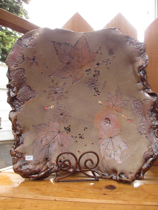
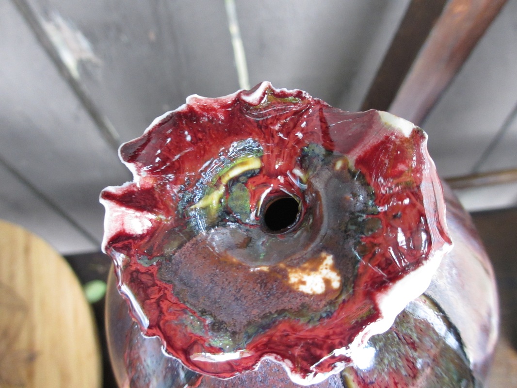
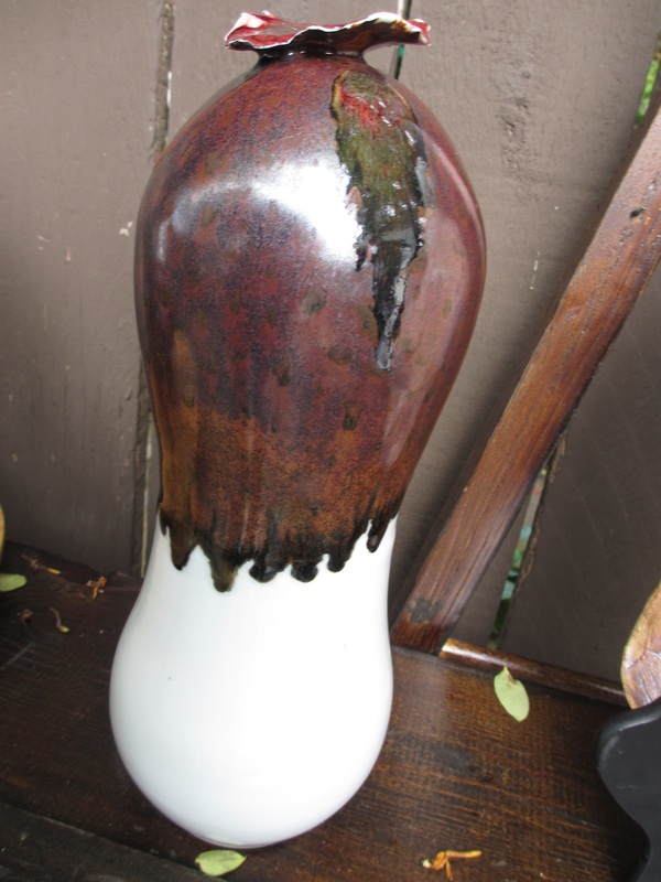
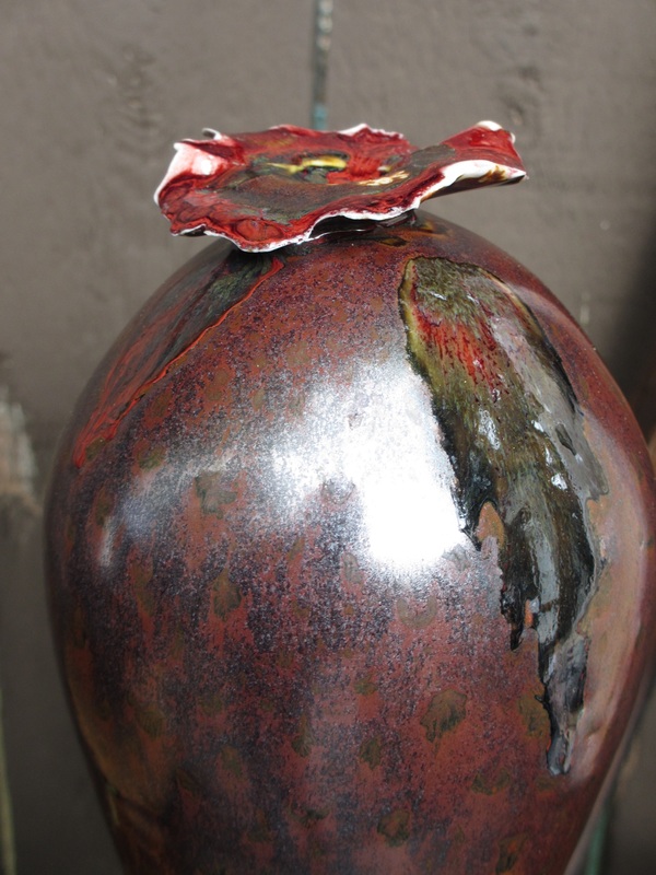
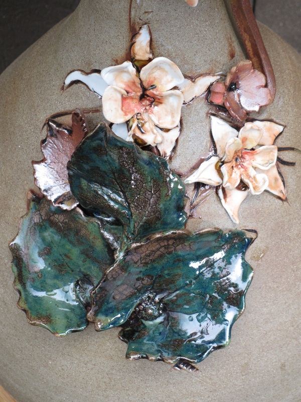
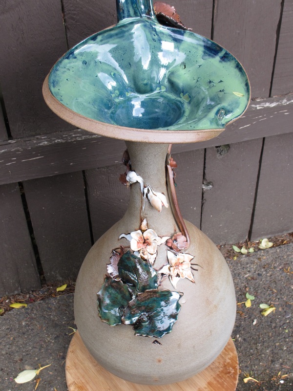
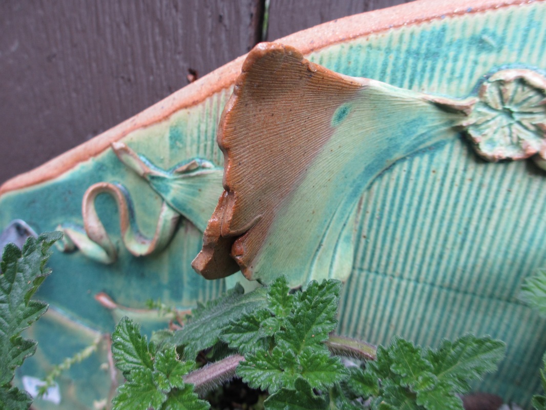
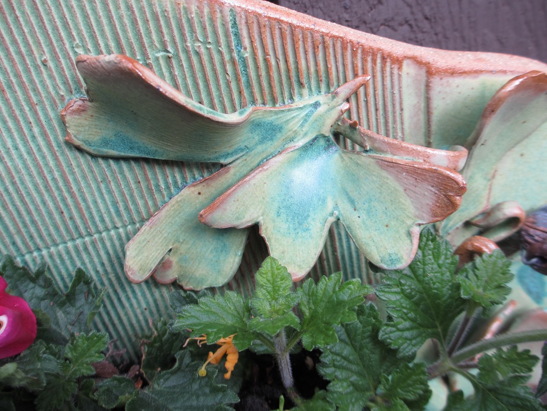
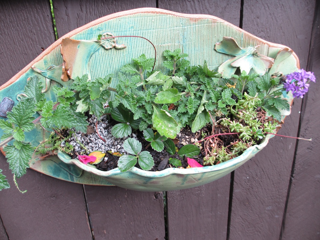
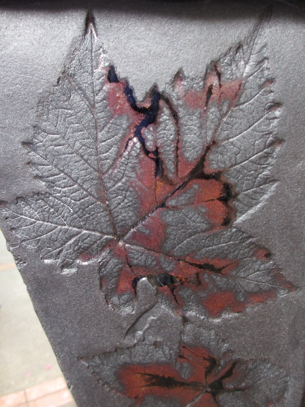
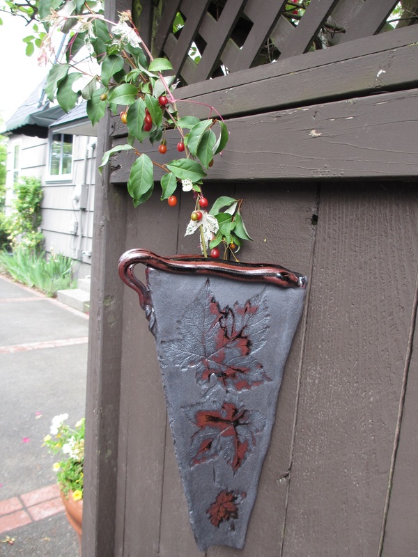
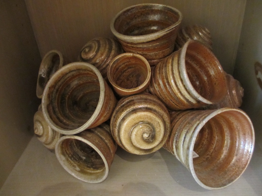
Work by Adrienne Stacey: I love this piece because it portrays so many sightings you can see in nature: imprints of leaves and flowers. The glaze, as you may have noticed, seeps willingly into the creases, cracks and crevices where it settles and then creates an effect of immense detail and compelling emphasis. The works of Adrienne Stacey are so captivating and intriguing, and even if they are never shown in a gallery or promoted to a position of wild popularity and fame, I will revere them forever more -- beginning from this very day. Click here to visit her FANTASTIC web page: http://www.adriennestaceypottery.com/studio
0 Comments
I titled this, "Melting Scarlet Poppy" (even though I'm sure the piece must have its own name) because there are streaks of glaze flowing down from the red poppy at the top of the form. I take great interest in the tiny glaze inflections you can see on the surface of the clay -- little hints and splotches of a dark, mossy green, painted over the primary hues of a rustic, copper-chestnut glaze. I especially enjoy the creative addition of the bright poppy on top, which for me is the finishing touch on the artwork. I also like looking at the pools and ringlets that the glaze forms when you leave it in the same spot for a long period of time... for example, you can see the glaze gathering in the center of the poppy.
Beautiful glazing!!! The almost luminescent colors really add to the piece's superiority. I love the patterns, colors, textures and designs on all of Stacey's pottery. I compliment Adrienne Stacey's artistic choice of titling this piece "Columbine/Snow-poppy Sectional Vase," because the artwork really seems to fit that description. The Snow-poppies depicted on the surface of this vase complete the work's pride, and all of the imitations of found, natural items attached to Stacey's ceramics give her pieces a sense of depth, complexity, uniqueness and originality, or deviation from the norm. I respect her artwork because it is not the type of bright pop-art you will see so often today, but instead a collection of many different interpretations and variations of reality. The growth associated with plants, flowers and trees also deliver to Stacey's art an animated, lively quality, as well as a dazzling sight of the ever-fleeting sacredness and beauty you'll find upon entering the outside world.
Just like a Venus flytrap, this ceramic shell-like, carnivorous-looking form also traps things... but it traps plants and flowers! You can see that Adrienne Stacey spent a lot of time and effort just making all of the ridges on the large flat plane of this sculpture, and she also must have meticulously pressed ginkgo leaves into the clay to get those beautiful, veined ceramic leaves that are elegantly attached to the form. The final product serves as a crafty, spacious plant holder as well as being positively marvelous to apprehend in all of its glamor and glory. I also love the color scheme coming into play here...the plants and flowers mirror and fit gorgeously with the honest, simply mixed colors of the glazed clay. I can see many cool colors -- purples, velvet greens and light aquamarines -- interweaving themselves throughout the artistic display.
This is the ceramic work of Adrienne Stacey -- she is an awesome potter and I absolutely idolize her! This is the first piece of hers I saw when I participated in the Mt. Tabor Art Walk, and you can see that the "plant pot" of sorts was created with much skill. The impression of the leaves upon the clay is beautiful and rare, and I love how the shimmering, opaque brown gaze collects in some areas of the leafy outlines. The prints are delicate-looking, and again, carefully constructed, and the shine of the silver form perfectly, expertly offsets the gleaming auburn coloration of the leaves. Every single detail is refined, and appears to be deliberate. The live plant only adds to the work's magnificence: it elaborates and justifies the ceramic piece, making the entire structure more natural, organic and full of raw, pulsating intricacy. As an entity, this work is one of the most eloquent I've seen in ages.
This picture was actually taken on my way to a local ceramicist's house during the Mt. Tabor Art Walk (2016.) I like how there are slight curved veins, almost imperceptible, that are running along the inside of the flower and creating concentric circles artistically pleasing to the eye. The aesthetics of this entire image as a whole are very satisfying, and reminiscent of famous photography (at least, I think so.) The camera captured the rich, saturated and vibrant colors of the naturally violet flower, reminding me of the glazing style I love to do on most of my nature-themed pieces. The fine details of the stamen, the tiny ant scuttling across the petal's surface, and the round, shiny beads of water clinging to the flower are what make this photo a true work of art. The focus of the lens is solely on the flower, and not the foggy, dim scenery behind it -- yet the background does play a part in unifying the piece, because of all the simple, solid colors and blurred greenery. These fainter colors balance out the vivid, prominent color of purple in the foreground of the frame. I titled the photo, "Violet Beads of Rain," because it looks as if the water droplets resting upon the flower were of a violet color.
This artwork is titled, "Face of the Aspen," most likely because of all the aspen trees emerging gracefully from the depths of the lake. I love the various rushes surrounding these trees, painted, it looks like, with many quick, sharp and haphazard brush strokes. The overall presentation of this watercolor painting is stunning and breathtaking, in my opinion, with the contrast of sunlit golden-green reeds and striped aspen trees on their background of shadowy blue, glimmering and reflective waters. In my mind, the whole scene conjures up the image of a peaceful, tranquil lake at dusk.
Here is a beautiful home my family visited on the Mt. Tabor Art Walk in Portland, Oregon. Their house had a labyrinth of intricate gardens surrounding it on all sides, completely blocking it off from the main road. When I was walking on their property and freely self-touring the gardens, it felt like I was isolated from society and on a different planet. The people who live here have the whole place to themselves, and it's like a paradise island in the middle of the sea!
This artwork was distinctly made on the wheel, judging by the way the cups' walls and base are continuously spiraling. I find the shape of the clay spirals really interesting, and I also appreciate the artist's choice of having some of the cups facing outward and some of them facing inward. The piece as a whole makes me think about the tentacles of an octopus, or a collection of trumpets owned by a neurotically fascinated musician. I love the curious earth tones used in the work, because they seem to balance out the entire mood of the piece. I dubbed the image "Stretching and Reaching," because it almost appears as though a non-human creature were doing an interpretive dance. The motion of the piece really emanates outward from the ceramic sculpture itself, and it draws your eye to the space surrounding it. There is almost a rhythmic beat to the life-like sculpture, and I like how its brown hues contrast nicely with the bright, vivid colors of the "Coral Cups."
|
AuthorWrite something about yourself. No need to be fancy, just an overview. Archives
May 2016
Categories |